Labels Cloud enables users to use a dynamic menu, and it has become very popular as a website add-on. Labels widget displays a list of the categories of posts. Creating labels
helps to categorize the posts in groups, so it helps visitors to see the
posts under a category. Default blogger Labels
widget is not so Stylish. byt don't worry, here I am sharing some cool
interesting labels widget styles for you. This Labels widget can be styled using simple CSS codes. To do this, follow the steps.

Go to Blogger Dashboard > Settings > Layouts
background-image: -moz-linear-gradient(left top , #FEDA71, #FEBA47);
border-bottom: 1px solid #D99D38;
border-left: 1px solid #D99D38;
content: "";
height: 1.39em;
left: -0.69em;
position: absolute;
top: 0.2em;
transform: rotate(45deg);
width: 1.3em;
z-index: 1;
}
.Label li:after {
background: none repeat scroll 0 0 #FFFFFF;
border: 1px solid #D99D38;
border-radius: 4.167em 4.167em 4.167em 4.167em;
box-shadow: 0 1px 0 #FAEABA;
content: "";
height: 0.5em;
left: -0.083em;
position: absolute;
top: 0.667em;
width: 0.5em;
z-index: 9999;
}
.Label li {
background-image: -moz-linear-gradient(center top , #FEDA71, #FEBA47);
border-bottom: 1px solid #D99D38;
border-radius: 0 0.25em 0.25em 0;
border-right: 1px solid #D99D38;
border-top: 1px solid #D99D38;
box-shadow: 0 1px 0 #FAEABA inset, 0 1px 1px rgba(0, 0, 0, 0.1);
color: #996633;
float: left;
font-family: 'Helvetica Neue',Helvetica,Arial,sans-serif;
font-size: 0.75em;
font-weight: bold;
list-style: none outside none;
margin: 0 0 7px 20px;
padding: 0.417em 0.417em 0.417em 0.917em;
position: relative;
text-decoration: none;
text-shadow: 0 1px 0 rgba(255, 255, 255, 0.4);
z-index: 1;
}
Black Forest Theme Labels with animated Scaling

.Label li {
background: linear-gradient(to bottom, #6B6B6B 0%, #6B6B6B 4%, #333333 1%, #2B2B2B 100%) repeat scroll 0 0 transparent;
border: 1px solid;
border-radius: 6px 6px 6px 6px;
float: left;
font-size: 116%;
list-style: none outside none;
margin: 2px;
padding: 4px;
transition: all 0.3s ease 0s;
}
.Label li:hover {
transform: rotate(351deg) scale(1.7);
}
.Label a {
color: #fff;
text-decoration: none;
}
.Label li:before {
background-image: -moz-linear-gradient(center top , #1E5799 0%, #207CCA 100%);
border-bottom: 1px solid #145091;
border-left: 1px solid #145091;
content: "";
height: 1.39em;
left: -0.69em;
position: absolute;
top: 0.2em;
transform: rotate(45deg);
width: 1.3em;
z-index: 1;
}
.Label li:after {
background: none repeat scroll 0 0 #FFFFFF;
border: 1px solid #3F6893;
border-radius: 4.167em 4.167em 4.167em 4.167em;
box-shadow: 0 1px 0 #B5D8FF;
content: "";
height: 0.5em;
left: -0.083em;
position: absolute;
top: 0.667em;
width: 0.5em;
z-index: 9999;
}
.Label li {
background-image: -moz-linear-gradient(center top , #1E5799, #207CCA);
border-bottom: 1px solid #145091;
border-radius: 0 0.25em 0.25em 0;
border-right: 1px solid #145091;
border-top: 1px solid #145091;
box-shadow: 0 1px 0 #CCE4FF inset, 0 1px 1px rgba(0, 0, 0, 0.1);
color: #996633;
float: left;
font-family: 'Helvetica Neue',Helvetica,Arial,sans-serif;
font-size: 0.75em;
font-weight: bold;
list-style: none outside none;
margin: 0 0 7px 20px;
padding: 0.417em 0.417em 0.417em 0.917em;
position: relative;
text-decoration: none;
text-shadow: 0 1px 0 rgba(255, 255, 255, 0.4);
z-index: 1;
}
Skeleton Theme with Painting Hover Effect

.Label a:hover
{
text-shadow:5px 5px 5px #dcdcdc;
background:orange;
border:1px solid orange;
border-bottom-right-radius: 0px;
border-top-left-radius: 0px;
border-bottom-left-radius: 30px;
border-top-right-radius: 30px;
}
Leaf theme for Labels Widget

.Label a {
-moz-border-bottom-colors: none;
-moz-border-left-colors: none;
-moz-border-right-colors: none;
-moz-border-top-colors: none;
background-color: #7FBF4D;
background-image: -moz-linear-gradient(center top , #7FBF4D, #63A62F);
border-bottom-right-radius: 30px;
border-color: #63A62F #63A62F #5B992B;
border-image: none;
border-style: solid;
border-top-left-radius: 30px;
border-width: 1px;
box-shadow: 0px 1px 0px 0px #96CA6D inset;
color: #FFFFFF;
float: left;
font: 14px verdana;
height: 18px;
margin-bottom: 9px;
margin-left: 10px;
padding: 10px;
position: relative;
text-decoration: none;
transition: all 0.5s ease-in-out 0s;
}
.Label a:hover {
background: none repeat scroll 0% 0% orange;
border-radius: 0px 30px 0px 30px;
border: 1px solid orange;
text-shadow: 5px 5px 5px #DCDCDC;
}
.Label {
margin: 0px;
padding: 0px;
position: relative;
}
Or a different model with the code below:

Hope you managed to Customize Labels Cloud on your Blogspot site.If you found this useful. feel free to leave a comment below!
Go to Blogger Dashboard > Settings > Layouts
- Click Add a Gadget > Labels
- Select Cloud Display once you’re inside the settings.
- Choose display 25 labels at most, because too much would look ugly.
- Save widget. Go to Settings > Template
- Backup your template.
- Click Edit HTML > Proceed then Look (control F) the code ]]></b:skin>
- Just above it, paste the code below:
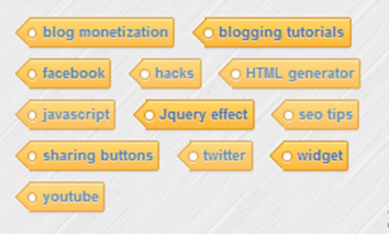
1. Yellow Customized labels Widget
background-image: -moz-linear-gradient(left top , #FEDA71, #FEBA47);
border-bottom: 1px solid #D99D38;
border-left: 1px solid #D99D38;
content: "";
height: 1.39em;
left: -0.69em;
position: absolute;
top: 0.2em;
transform: rotate(45deg);
width: 1.3em;
z-index: 1;
}
.Label li:after {
background: none repeat scroll 0 0 #FFFFFF;
border: 1px solid #D99D38;
border-radius: 4.167em 4.167em 4.167em 4.167em;
box-shadow: 0 1px 0 #FAEABA;
content: "";
height: 0.5em;
left: -0.083em;
position: absolute;
top: 0.667em;
width: 0.5em;
z-index: 9999;
}
.Label li {
background-image: -moz-linear-gradient(center top , #FEDA71, #FEBA47);
border-bottom: 1px solid #D99D38;
border-radius: 0 0.25em 0.25em 0;
border-right: 1px solid #D99D38;
border-top: 1px solid #D99D38;
box-shadow: 0 1px 0 #FAEABA inset, 0 1px 1px rgba(0, 0, 0, 0.1);
color: #996633;
float: left;
font-family: 'Helvetica Neue',Helvetica,Arial,sans-serif;
font-size: 0.75em;
font-weight: bold;
list-style: none outside none;
margin: 0 0 7px 20px;
padding: 0.417em 0.417em 0.417em 0.917em;
position: relative;
text-decoration: none;
text-shadow: 0 1px 0 rgba(255, 255, 255, 0.4);
z-index: 1;
}
Black Forest Theme Labels with animated Scaling
.Label li {
background: linear-gradient(to bottom, #6B6B6B 0%, #6B6B6B 4%, #333333 1%, #2B2B2B 100%) repeat scroll 0 0 transparent;
border: 1px solid;
border-radius: 6px 6px 6px 6px;
float: left;
font-size: 116%;
list-style: none outside none;
margin: 2px;
padding: 4px;
transition: all 0.3s ease 0s;
}
.Label li:hover {
transform: rotate(351deg) scale(1.7);
}
.Label a {
color: #fff;
text-decoration: none;
}
Blue Customized Labels Widget

background-image: -moz-linear-gradient(center top , #1E5799 0%, #207CCA 100%);
border-bottom: 1px solid #145091;
border-left: 1px solid #145091;
content: "";
height: 1.39em;
left: -0.69em;
position: absolute;
top: 0.2em;
transform: rotate(45deg);
width: 1.3em;
z-index: 1;
}
.Label li:after {
background: none repeat scroll 0 0 #FFFFFF;
border: 1px solid #3F6893;
border-radius: 4.167em 4.167em 4.167em 4.167em;
box-shadow: 0 1px 0 #B5D8FF;
content: "";
height: 0.5em;
left: -0.083em;
position: absolute;
top: 0.667em;
width: 0.5em;
z-index: 9999;
}
.Label li {
background-image: -moz-linear-gradient(center top , #1E5799, #207CCA);
border-bottom: 1px solid #145091;
border-radius: 0 0.25em 0.25em 0;
border-right: 1px solid #145091;
border-top: 1px solid #145091;
box-shadow: 0 1px 0 #CCE4FF inset, 0 1px 1px rgba(0, 0, 0, 0.1);
color: #996633;
float: left;
font-family: 'Helvetica Neue',Helvetica,Arial,sans-serif;
font-size: 0.75em;
font-weight: bold;
list-style: none outside none;
margin: 0 0 7px 20px;
padding: 0.417em 0.417em 0.417em 0.917em;
position: relative;
text-decoration: none;
text-shadow: 0 1px 0 rgba(255, 255, 255, 0.4);
z-index: 1;
}
Skeleton Theme with Painting Hover Effect
.Label a:hover
{
text-shadow:5px 5px 5px #dcdcdc;
background:orange;
border:1px solid orange;
border-bottom-right-radius: 0px;
border-top-left-radius: 0px;
border-bottom-left-radius: 30px;
border-top-right-radius: 30px;
}
.Label li {
border: 1px solid;
border-radius: 6px 6px 6px 6px;
color: #000000 !important;
float: left;
font-size: 116%;
list-style: none outside none;
margin: 2px;
padding: 4px;
transition: all 0.3s ease 0s;
}
.Label a {
color: #000;
text-decoration: none;
}
.Label li:hover {
transform: rotate(5deg);
}
Leaf theme for Labels Widget
.Label a {
-moz-border-bottom-colors: none;
-moz-border-left-colors: none;
-moz-border-right-colors: none;
-moz-border-top-colors: none;
background-color: #7FBF4D;
background-image: -moz-linear-gradient(center top , #7FBF4D, #63A62F);
border-bottom-right-radius: 30px;
border-color: #63A62F #63A62F #5B992B;
border-image: none;
border-style: solid;
border-top-left-radius: 30px;
border-width: 1px;
box-shadow: 0px 1px 0px 0px #96CA6D inset;
color: #FFFFFF;
float: left;
font: 14px verdana;
height: 18px;
margin-bottom: 9px;
margin-left: 10px;
padding: 10px;
position: relative;
text-decoration: none;
transition: all 0.5s ease-in-out 0s;
}
.Label a:hover {
background: none repeat scroll 0% 0% orange;
border-radius: 0px 30px 0px 30px;
border: 1px solid orange;
text-shadow: 5px 5px 5px #DCDCDC;
}
.Label {
margin: 0px;
padding: 0px;
position: relative;
}
.Label li:hover {
transform: rotate(5deg);
}
.Label li {
float: left;
font-size: 116%;
list-style: none outside none;
transition: all 0.3s ease 0s;
}
Or a different model with the code below:
.label-size{ margin:0 2px 6px 0; padding: 3px; text-transform: uppercase; border: solid 1px #C6C6C6; border-radius: 3px; float:left; text-decoration:none; font-size:10px; color:#666; } .label-size:hover { border:1px solid #6BB5FF; text-decoration: none; -moz-transition: all 0.5s ease-out; -o-transition: all 0.5s ease-out; -webkit-transition: all 0.5s ease-out; -ms-transition: all 0.5s ease-out; transition: all 0.5s ease-out; -moz-transform: rotate(7deg); -o-transform: rotate(7deg); -webkit-transform: rotate(7deg); -ms-transform: rotate(7deg); transform: rotate(7deg); filter: progid:DXImageTransform.Microsoft.Matrix( M11=0.9961946980917455, M12=-0.08715574274765817, M21=0.08715574274765817, M22=0.9961946980917455, sizingMethod='auto expand'); zoom: 1; } .label-size a { text-transform: uppercase; float:left; text-decoration: none; } .label-size a:hover { text-decoration: none; }
- 8. Finally, click the Save button. Cheers!!
Hope you managed to Customize Labels Cloud on your Blogspot site.If you found this useful. feel free to leave a comment below!
Comments
Post a Comment